3 Graph Types
Choosing the right graph type for your visualization can be daunting, but makes a world of difference for your audience.
3.1 From Data to Viz
This tool provides an easy flow chart to decide what graph types are appropriate for your data and sometimes provides code examples of how to implement it in R! Out of the appropriate graphs, you will still need to decide which graph conveys your information the best.
Visit the website and try it out for yourself: from Data to Viz
3.2 What to Avoid
There are some very popular graph types that often seem intuitive, but in practice, they make data harder to interpret rather than easier.
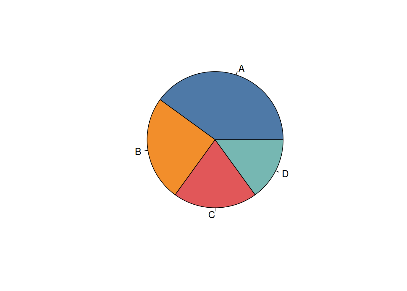
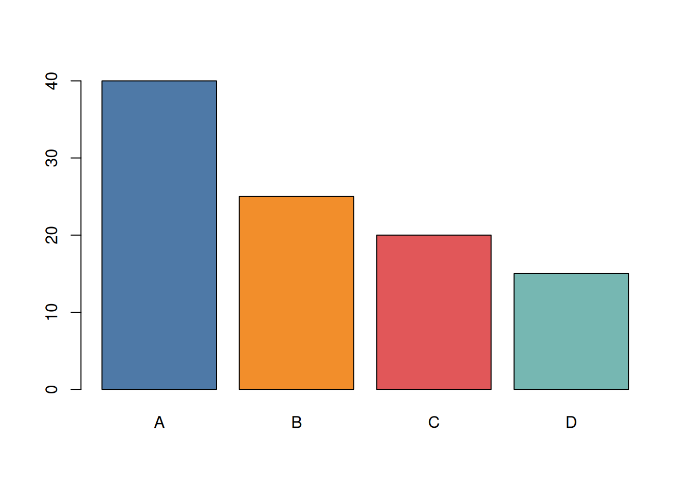
3.2.1 Pie Charts
Pie charts are commonly used to show proportions, but they rely on angles and area, which humans are not great at comparing. This makes it difficult to accurately judge differences between categories, especially when values are similar.
A better alternative to a pie chart is a bar plot:
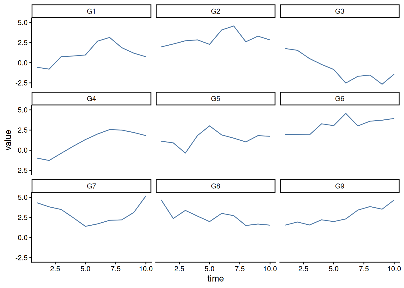
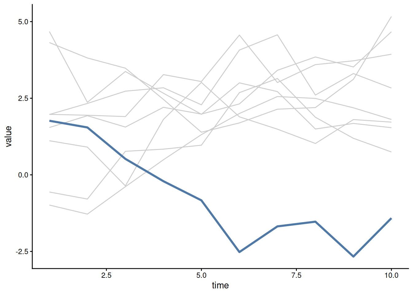
3.2.2 Spaghetti Charts
When trying to compare the same data across different groups, the temptation is to just plot a different line for each group. However, this can easily become a visual nightmare.
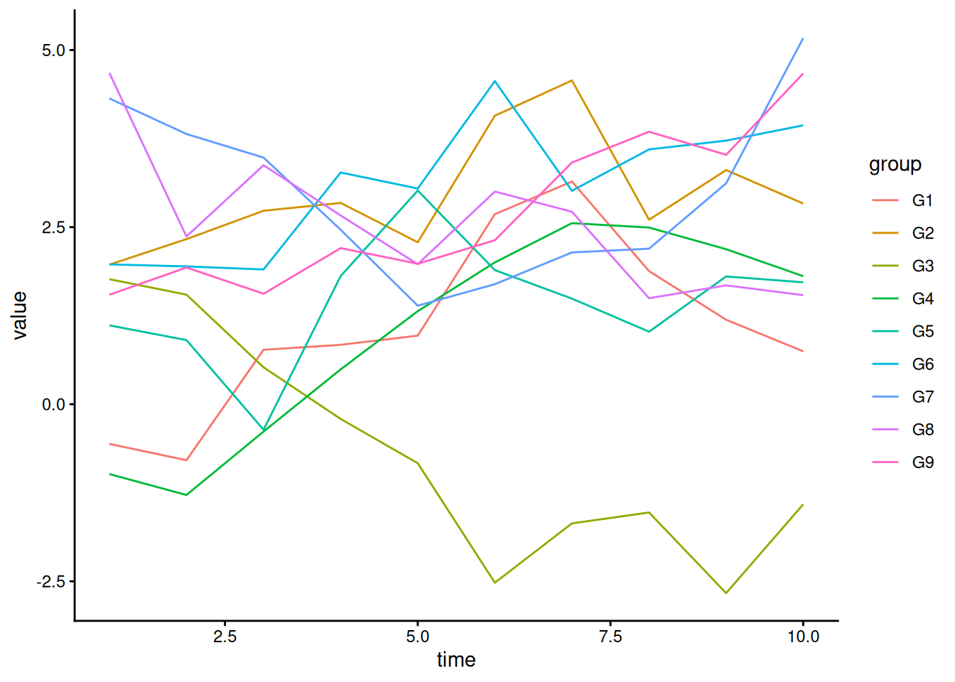
One alternative is to split the plots into multiple “facets”, or subplots. We will look at how to implement this in R in later sections.
Sometimes, you want to highlight a specific group as it compares to the other groups in the dataset. A spaghetti plot is fine here, but with appropriate highlighting using color and line width:
3.3 Field Conventions
In many fields there are standard or conventional visualizations that are used. When those conventions makes sense and the information is conveyed well, stick to them.
But, do not be afraid to use your creative license where conventions are bad or don’t make sense. Often conventions are arbitrary, and you might make a big difference in your field by introducing a new way to visualize the data.